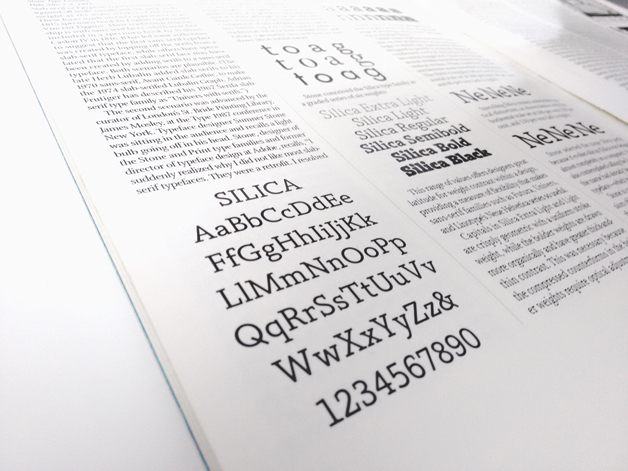
[responsive] [/responsive]Yesterday we told you about Print magazine’s 75th anniversary issue; today we expand on one of the articles, The History of Typography in Print Magazine by Paul Shaw.
According to Shaw, “Print has been chronicling graphic design for 75 years, yet the magazine’s typography has been an uneven barometer of the typographic trends of those years.”
Shaw provides an in-depth perspective on how changing technology, culture and trends influenced graphic design. As the industry moved from metal type to phototype, the covers did the same, with forays into hand lettering and the occasional image-only cover.
The article offers a fascinating archive of the magazine’s evolution, in which the reader can almost feel the strident changes taking place in the larger world – the modernistic ‘50s, the political ‘60s, the conservative ‘80s – it’s a history lesson in much more than graphic design.
It’s a good piece, worthy of a longer read and a deep dive.
