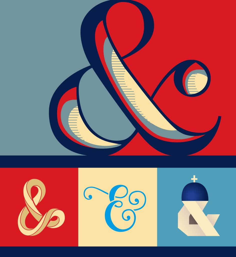
 Type geeks, this one’s for you…15 typographers introduce us to their favorite letterforms. The love is real.
“The lowercase ‘a’ is a perpetual oddball,” declares Tobias Frere Jones. “Most letters of the alphabet have deep alliances with each other, sharing bowls, serifs and terminals,” the founder of Frere-John Foundry. On the other hand, he notes, “the ‘a’ stands apart from those tight cliques with a collection of one-off shapes. It also appears over and over, potentially arguing with its neighbors in a word.”
This kind of intense personification of the letters of the alphabet is one of the reasons why we are so glad that font geeks exist. Clearly Wired Magazine is too, as they offer the “15 Typographers Introduce Us to Their Favorite Letterforms” slideshow.
For Brazilian-born designer Yomar Augusto, his favorite letter is the uppercase R. “It has an incredible force that combines vertical, horizontal, diagonals and round shapes, carrying almost the entire DNA of an uppercase family,” he says.
Meanwhile designer Sara Soskolne has a major crush on the eszett or German Sharp S. “It takes up more real estate than the rest of the Latin lowercase, so it can feel quite roomy—but a lot has to happen inside that space. It also has a very satisfying asymmetry: rising up from the baseline in a straight line, resembling the left half of the f, it then sweeps over to the right much more grandly than the f ever has room to do,” she gushes.
We love that type designers and artists have such strong feelings about these things, even if mere mortals don’t really pay attention. It’s their passion and eye that transports design from common place to extraordinary, telling a story with just a stroke here or a serif there.
Shine on, font geeks.
