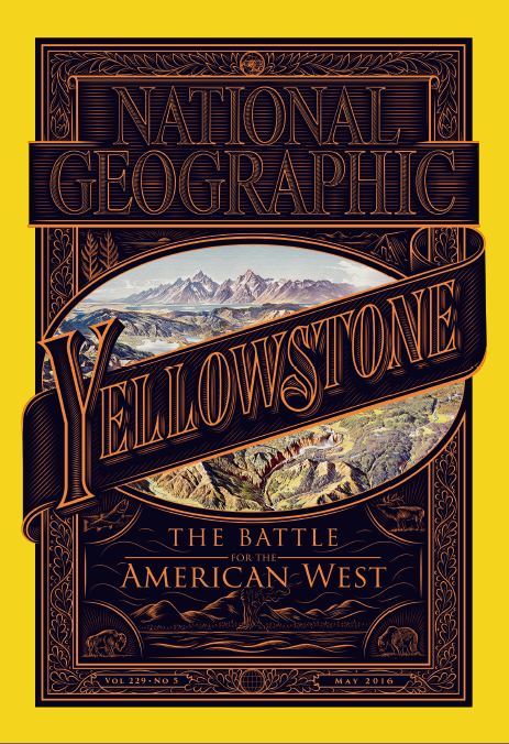
 A photographic icon launches an Old West typeset cover… and the results are perfection.
The brand is synonymous with striking imagery. I suspect almost anyone you know could instantly recognize a couple of the most iconic National Geographic covers: The haunting eyes of the young Afghan woman in 1985, or Koko the gorilla handling the camera in 1978 are simply unforgettable.
The recent cover makes a dramatic statement of its own for the very fact that it is not about the photography.
Caysey Welton, writing in MinOnline, interviewed the title’s creative director Emmet Smith to understand how the cover for its “Battle for the American West” issue came to be.
“While this particular issue has been in the works for a while, to say the least (the entire issue is one story by David Quammen) we didn’t start working on the cover until much of the issue was complete. The cover process here is pretty organic,” Smith explained.
“This one started in earnest one Friday evening when a group of us were looking at a first edit of the whole issue up on a wall. We naturally started talking about which images might be good for the cover. We went through outtakes, photographers’ Instagram accounts, and historical images. But each individual image felt too specific. I suggested — almost jokingly — that we didn’t have to have a photo, that we should try some typographic approaches. After a few moments of silence, Bill Marr, who was previously the Creative Director here and designed much of the issue, said, ‘that’s actually not a bad idea.’ And we went from there.”
Not a bad idea at all.
The combination of color, typeface and photo framing instantly draws the reader into an appropriate frame of reference to dive into the article and the serious topics it covers, without getting nostalgic or “allowing it to be saccharine,” as Smith puts it.
“Honestly, the best thing about this cover is the stuff it’s covering up. We show Yellowstone as I’ve never seen it. It’s phenomenal visual storytelling on a cinematic scale. What could be better than that? The cover itself? Lettering is a tricky thing to get the tone right on, and I think Jordan nailed the voice here. It, of course, feels historic and epic, but also has a bit of urgency to it,” he notes.
It is a brilliant design job and we expect this one to take its place in the ranks of highly memorable covers.