This week, our font choices demonstrate how focusing on balance and structure leaves room for tons of creative expression on all channels.
 You might think a typeface can’t be all about balance and structure and still embody tremendous personality. This week we’ve got two fonts we think may change your mind.
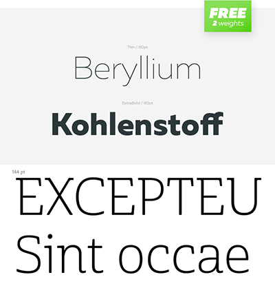
First, there’s Muller, available free in both Thin and Extra Bold. It features a wider letter structure for better readability at small sizes, making it a solid choice for creating a cohesive, polished look with multiple weights of the same font. Its versatility makes it a good option for text-heavy projects (magazine layouts, web pages) and branding. Because it was designed to work in 20 different weights (some free, some paid), this font family can handle the load in everything from advertising and packaging to branding and screen projects. Download yours from FontFabric.
Next we present Cabrito in both Semi-light and Medium, by Jeremy Dooley. He believes that “type is very much like music,” and Cabrito makes the case for this idea. Its strength comes from a firm grasp on balance, while its semi-serif (a winning combination of sans-serif & serif qualities) and rounded corners make for a casual, accessible appearance that sings along. It’s perfect for multipurpose design applications; the hybrid design makes it unique yet versatile for cross-channel projects from websites to product packaging. Grab yours at MyFonts.
We hope you enjoy all these free fonts on Fridays as much as we like bringing them to you. As always, show the designers and the foundries some love, and come back next week for more.