 If you aren’t yet familiar with John McWade, take this opportunity to get to know him. McWade is the founder of Before & After, and is now on the staff of Lynda.com. He has a bi-weekly series of videos for designers, covering everything from typography to color to logo design.
And he packs a ton into his short tutorials.
This one is a fascinating look on color matching called “Close enough on color choice.” He tells the story of a designer whose client wanted the exact same color on her business cards and her office walls – not an outrageous request for a brand, really. But she was pulling her hair out trying to make that happen, and came to McWade for advice.
In his video, he does a great job of explaining why this is basically impossible.
“Even if she rolled the client’s wall paint on to the business card, it wouldn’t look the same,” he says.
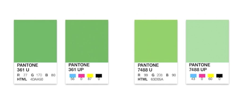
He goes on to explain the difference between solid inks (think paint, already mixed) and process inks (printed as CMYK blends.) He also does a good job of explaining the difference between how our eyes process color, as opposed to our design devices.
McWade offers some good advice for brands looking to maintain color standards; it’s definitely worth a watch. And his examples of color illusions are pretty trippy. Enjoy!